In recent months FamilySearch has been experimenting with different designs for the historical records search page. These changes have led to confusion and frustration on the part of some users. (For example, see feedback to a Facebook post by Pat Richley-Erickson.)
CHANGES
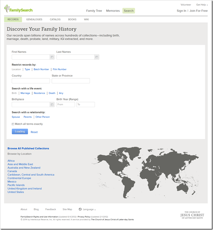
Previously, a “Browse All Published Collections” link sat just beneath the search button. It led to a list of all collections. The list is used extensively by experienced genealogists. Underneath it was a list of links leading to the collection list filtered to a particular region of the world. An inert world map sat just to the right.

In an effort to make it more visible, FamilySearch moved the “Browse All Published Collections” link up and to the right of the search form. (I don’t have a screen shot of that.) This placed it “above the fold,” meaning there was no need to scroll down to see it. The inert map moved with it, although I can’t remember if it sat above or beneath.
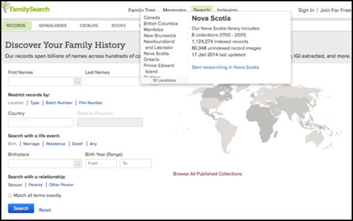
FamilySearch next made the world map interactive. Click on a region of the world and FamilySearch displays a list of countries in that region. Click on a country and FamilySearch displays summary information about its collection. A third click takes you to a page specific to that country or U.S. state. (See “FamilySearch Offers an Interactive World Map for Searches” on the FamilySearch Blog.) When the world map became interactive, the browse-all link remained just underneath it:

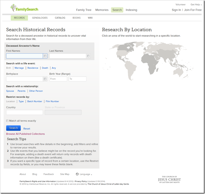
Recently, FamilySearch moved the browse-all link back down underneath the search button and added some search tips underneath it. This change hid the link from many users. The interactive map stayed to the right of the search form.

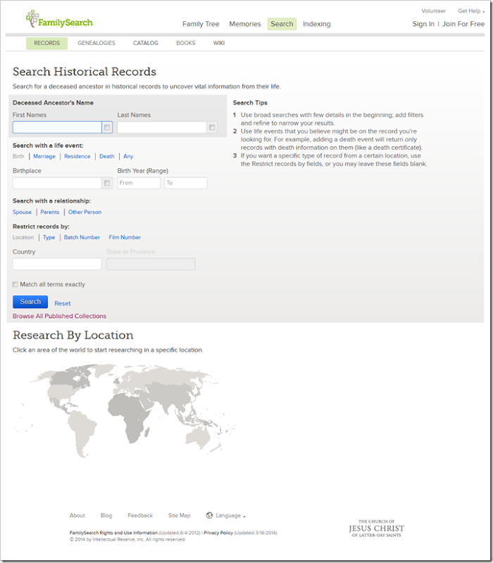
To further confuse the situation, the FamilySearch.org website is designed to respond to different size screens. This is most helpful for mobile devices, but also affects laptop and desktop computers. As window size gets smaller, elements of the website move around. For example, if the screen width is a little too small, FamilySearch swaps the location of the search tips and the world map:

In all these machinations, the browse-all link remains where it usually was: underneath the search button.
COLLECTION LIST VERSUS COUNTRY PAGES
One element lost in the redesign was a list of links to the collection list filtered to world regions. This has led to confusion when users use the interactive map as a substitute. Take the United States as an example. The filtered collection list for the U.S. has camera icons indicating collections with images. It has record counts indicating collections with indexed records. There are three possible combinations: images only, records only, or both.

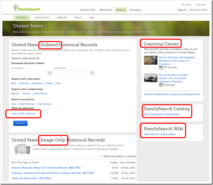
In comparison, the country-specific search page for the United States is… well… incomparable. It’s apples and oranges. It’s not designed to be a list of collections. Instead, it is a more holistic reflection of genealogists’ focus on location-based research.

The page is dominated by a search form for searching indexed historical records. Beneath that is a list of image-only record collections. The idea is to make the existence of these collections more visible to the less-experienced user. In the right column are three boxes. The Learning Center box advertises the existence of the Learning Center, highlights two of its online courses, and links to the complete list of courses about the target country. The FamilySearch Catalog box links to the catalog with the country (in this case, the United States) already entered into the place field. The FamilySearch Wiki box links to the wiki article about the target country.
Set unobtrusively above the Search button is a link to show a list of the indexed collections. Its purpose is to enable a search of a subset of all collections. While the list was not designed to fill the same role as the collection list, the addition of camera icons would be a major improvement. Indexed collections with images are far more valuable than those without. To effectively select a subset of collections, a user needs to be able to distinguish the two.
PARTIALLY INDEXED COLLECTIONS
There is another weakness to both the collection list and the country pages. Some collections are only partially indexed. To completely search the collection, you must browse images in addition to searching the index. FamilySearch does nothing to inform users of partially indexed collections (other than an occasional hint dropped in a collection description or a Wiki article). Ideally, FamilySearch should show what percentage of the posted images have been indexed. If calculating a percentage is beyond FamilySearch’s technology, users would still appreciate a little icon indicating the presence of unindexed images. If that too exceeds FamilySearch’s abilities, FamilySearch should show three columns: collection name, record count, and image count. Comparison of the two will often signal the lack of a complete index.
THE COLLECTION LIST
The collection list is still available and the link is still just beneath the search button. I use the collection list constantly, so I have it prominently bookmarked in the middle of my bookmark toolbar. Here’s the URL to bookmark: https://familysearch.org/search/collection/list.
Since I don’t like how long it takes to load that page, I also bookmark the collection list filtered to the United States: https://familysearch.org/search/collection/list/?page=1®ion=UNITED_STATES.
FamilySearch should consider restoring the links it removed from the search page:
If they don’t, you can filter the collection list yourself. Click the browse-all link beneath the search button. Then click the place filters to the left of the collection list.
SUMMARY
In what seems like just a single month, FamilySearch’s numerous changes to the Search page have left users confused. Obscuring the location of the Browse All Published Collections link and removing the other location links effectively removed the collection list page. Country-specific pages appeared to be an inadequate replacement. The indexed collection list is hidden and lacks camera icons.
The good news is that the collection list isn’t really gone and it remains unchanged. The link to it still sits underneath the search button. And the new, country-specific pages add functionality previously unavailable.
 It is as though our ancestors want to be found. Uncanny coincidences. Olympian luck. Phenomenal fate. Tremendous intuition. Remarkable miracles. We call It, “Serendipity in Genealogy.”



 Dear Ancestry Insider,